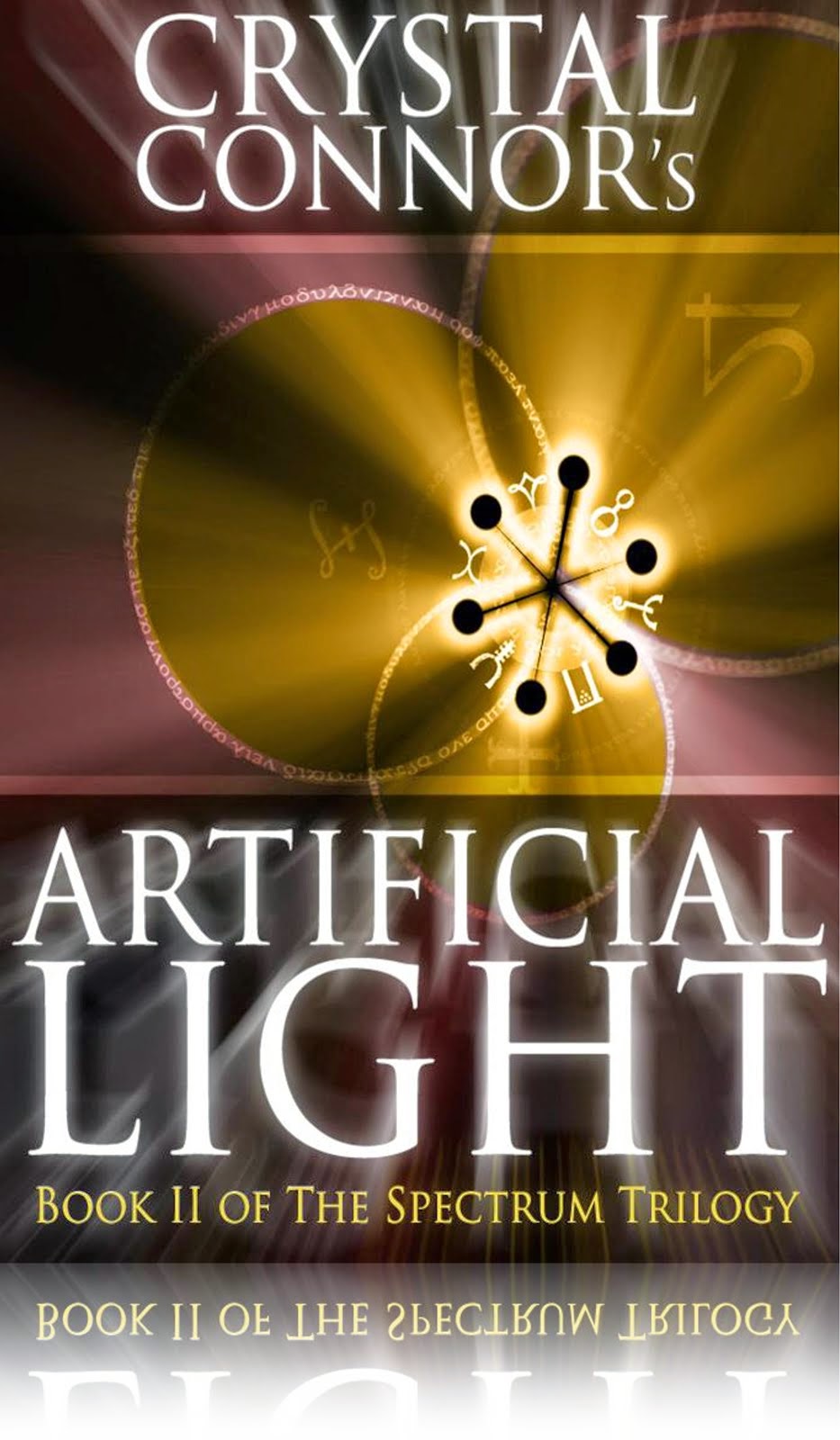
So needless to say I was becoming more that just a little worried as Artificial Light began to unfold itself into the complex, nail-biting, roller coaster of a ride that it’s become and at Chptr XXXIII I still had no idea of how or what I wanted the cover of this 2nd book to look like.
Because both power players in this trilogy are women I knew I wanted a woman on the cover, & because of the title I also wanted some sort of play on light and it needed to be pretty … but what I didn’t want is for the cover to look like everyone else’s.
As I’m sure most of you are aware, I am a high-maintenance drama queen with combative and belligerent tendencies who’s not easy to please, and though that has resulted in some pretty phenomenal results it can sometimes be my Achilles heel.
A couple of nights ago, actually it’s been about a week, I sloppily wrote “binary code” in my notebook on my nightstand either while I was dreaming or right as I was waking up & fell back asleep because I don’t remember writing it and had no idea what it meant but I have been thinking about it every sense.
At approx 4am this morning this is what I came up with:

I’m going to pass this off to an artist because it needs a little tweaking she needs darker skin and curlier, darker hair but basically boys and girls this is the cover art for Artificial Light.
I have been up all night and half the day working on A.L. since last Friday so I bought some Tylenol PM so that I can force myself to go to sleep, I missed a breakfast date with my BFF this morning because I was totally delirious from being up all night. I was talking to myself but didn’t understand a word I was saying …that’s pretty bad =/
Til next time guys,


I like it! Can't wait to see it when it's finished. I do like the fact that you want your covers to be different. It's refreshing. :)
ReplyDeleteThank you! Like I said it needs a little work, but as far as the cookie cutter cover art goes I'm way over it.
ReplyDelete